CUMFY is a design project about social change and giving a voice to women’s sexual pleasure and feelings of shame, topics that are often kept quiet.
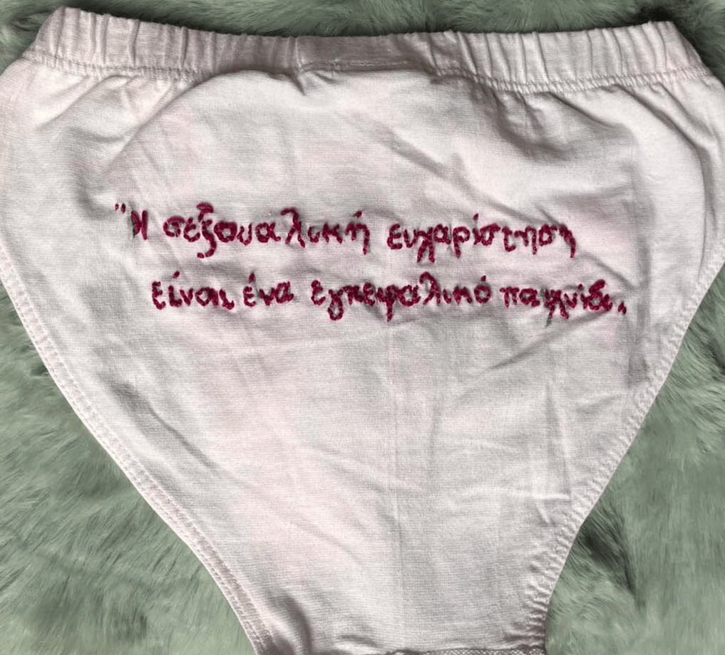
The entire project is built on real women’s voices. It started with deep, personal interviews where women openly shared their experiences regarding self-image, pleasure, and social pressure. These genuine quotes became the raw material for the whole brand.
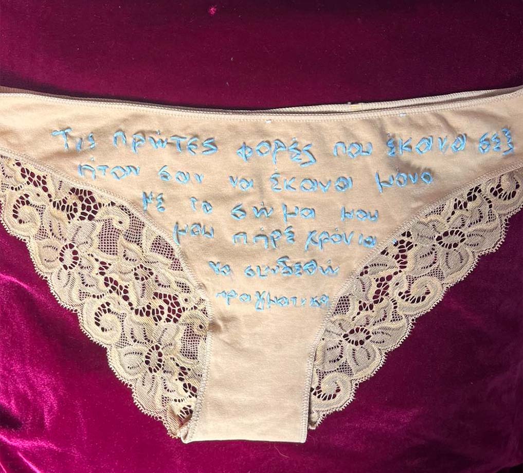
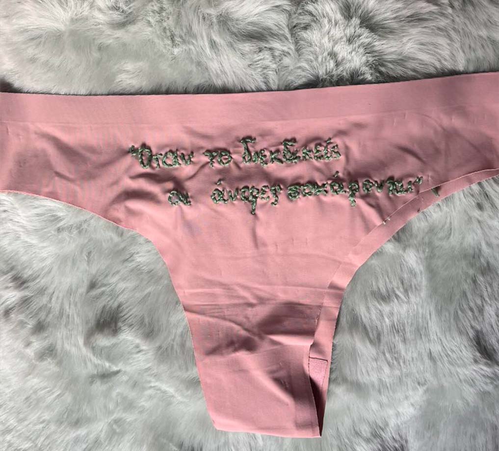
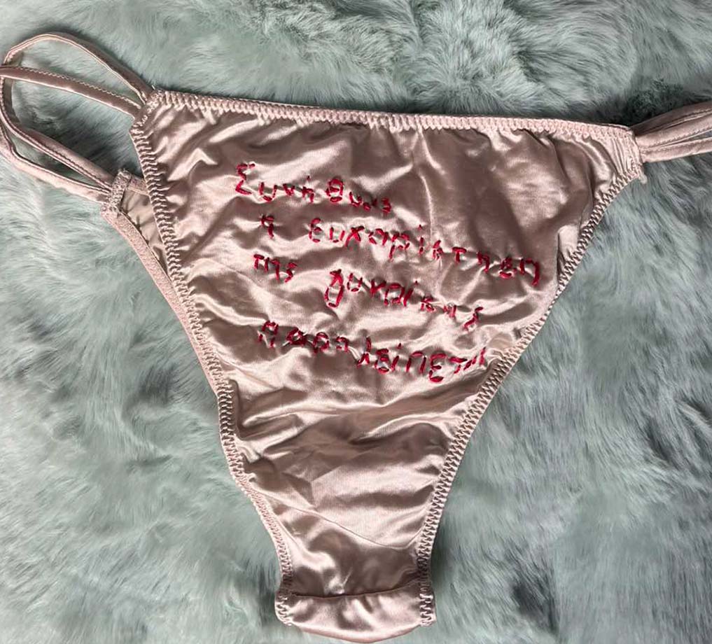
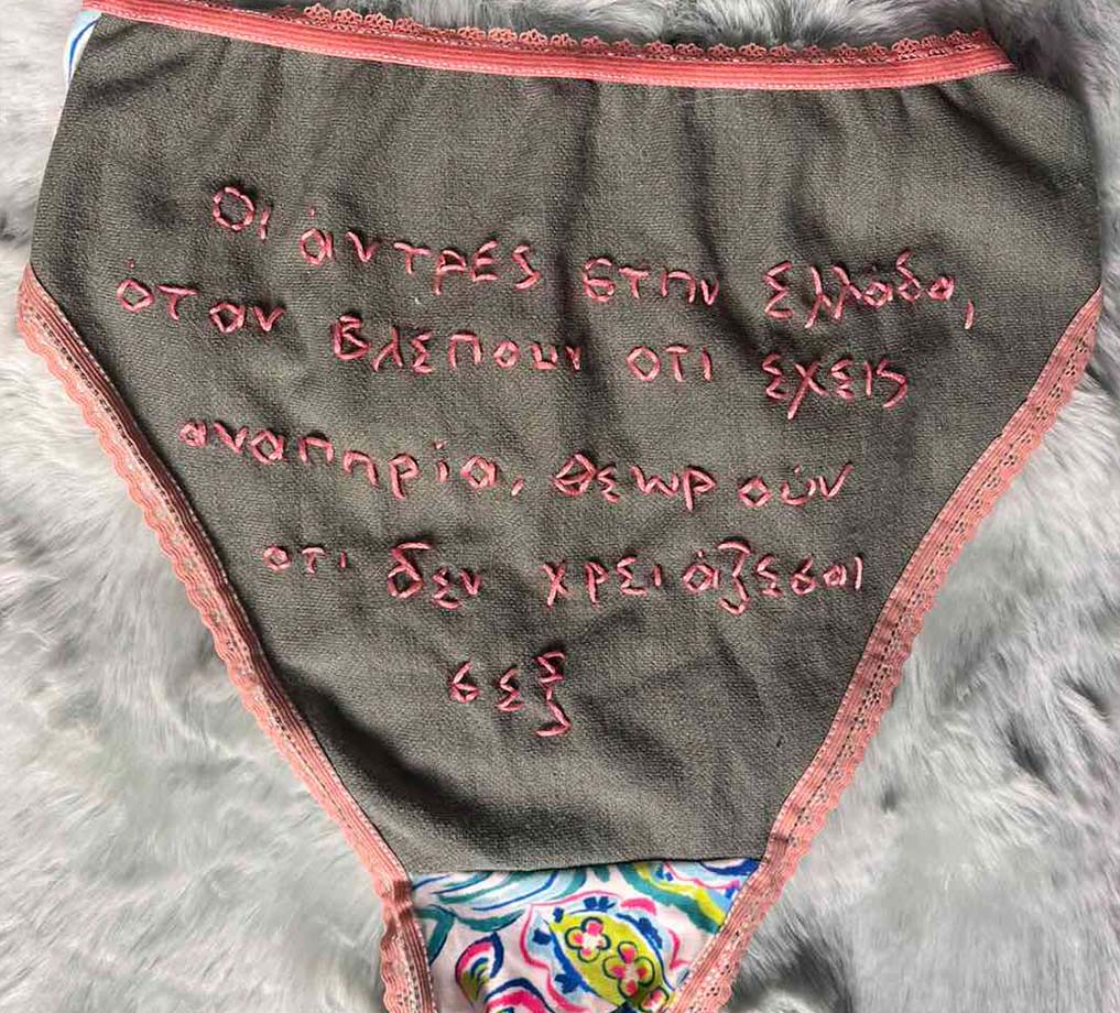
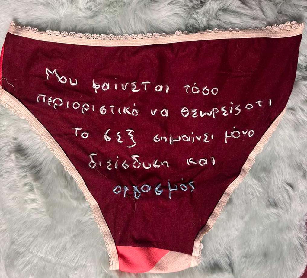
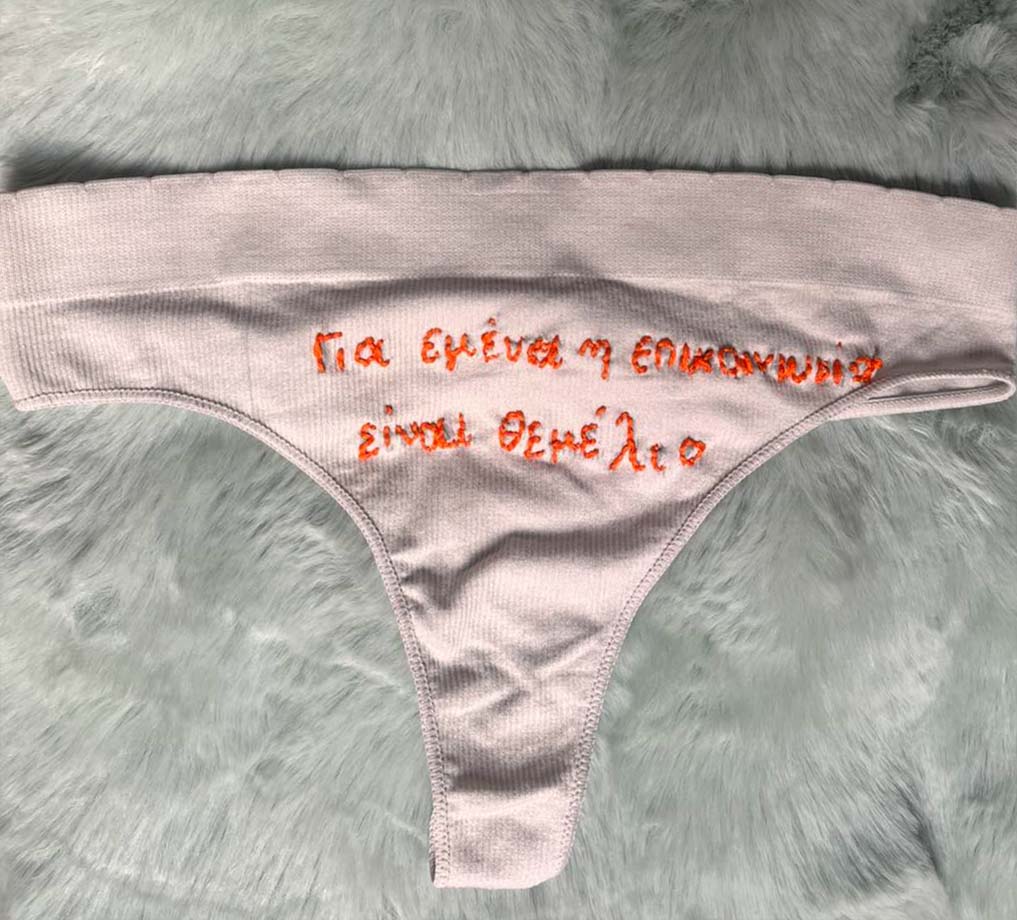
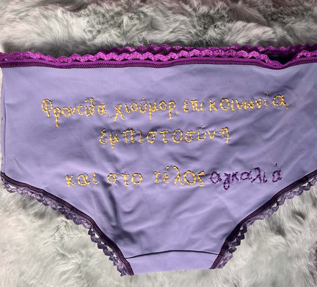
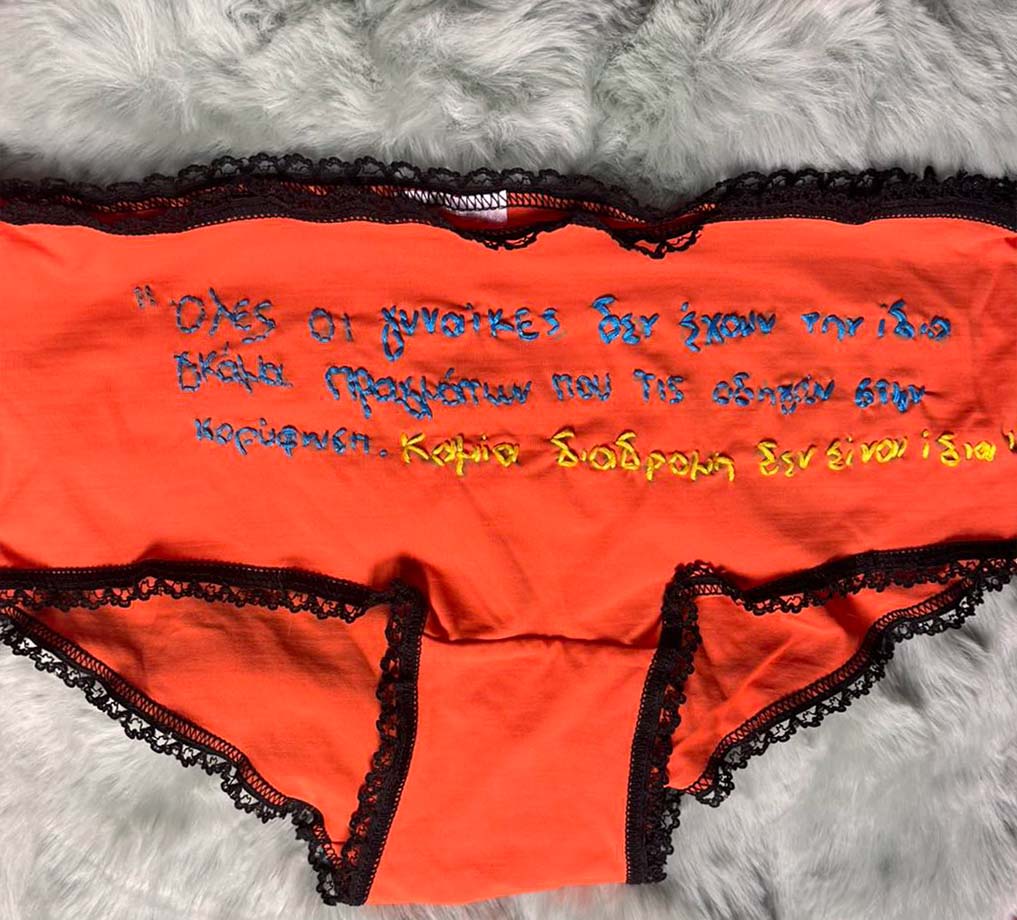
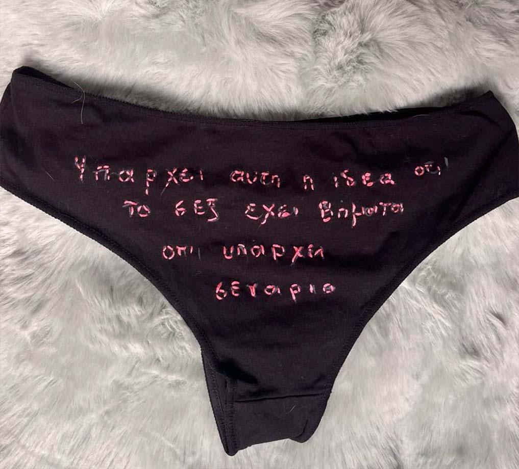
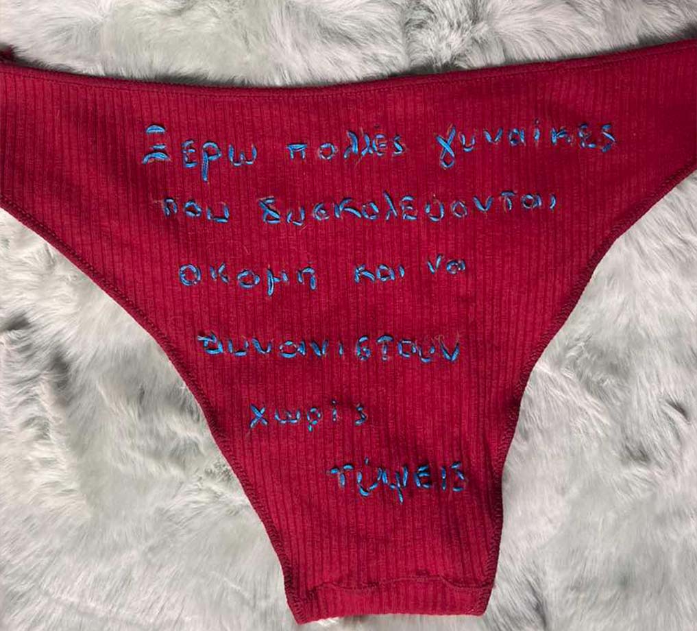
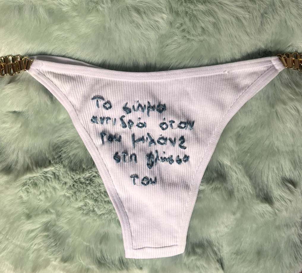
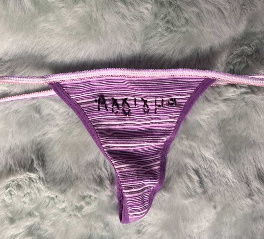
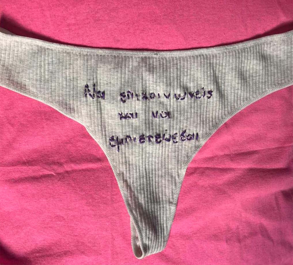
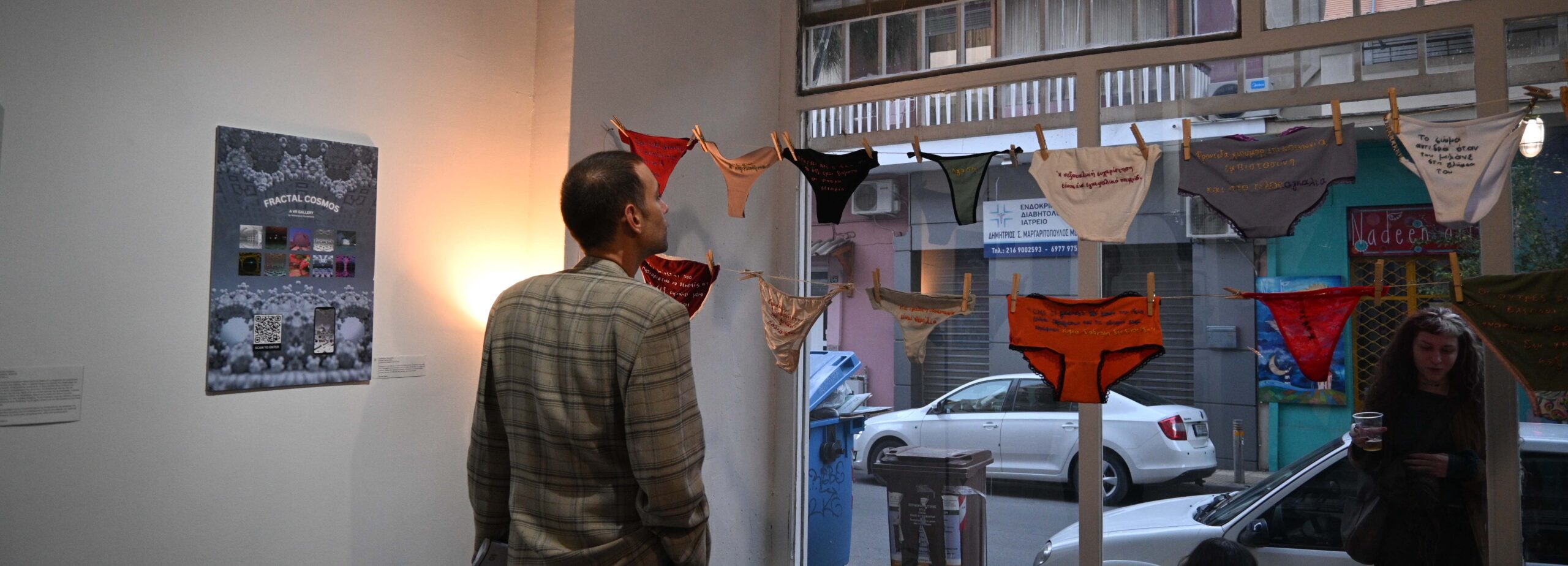
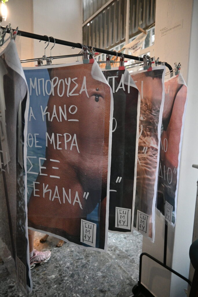
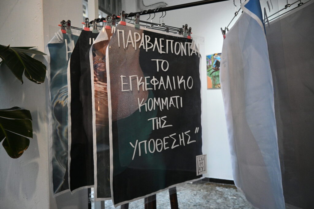
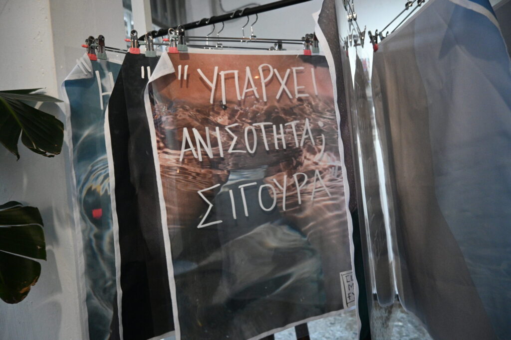
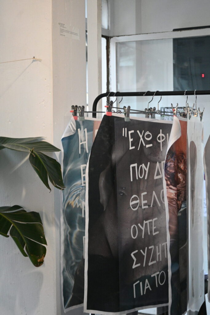
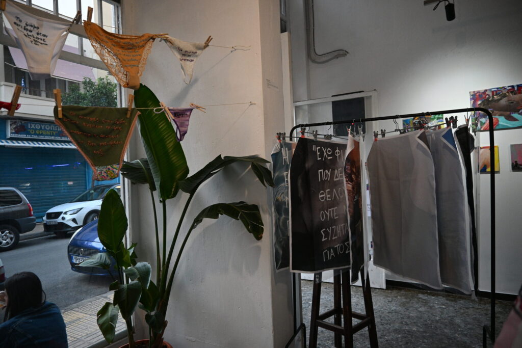
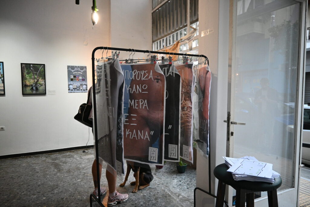
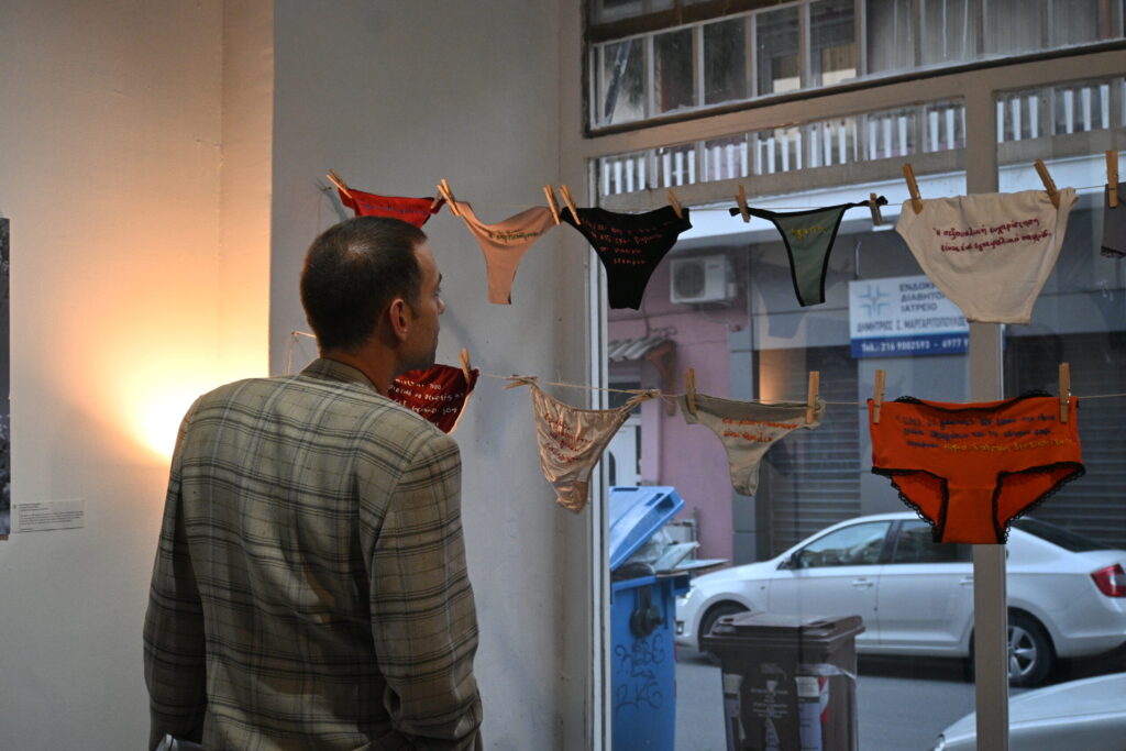
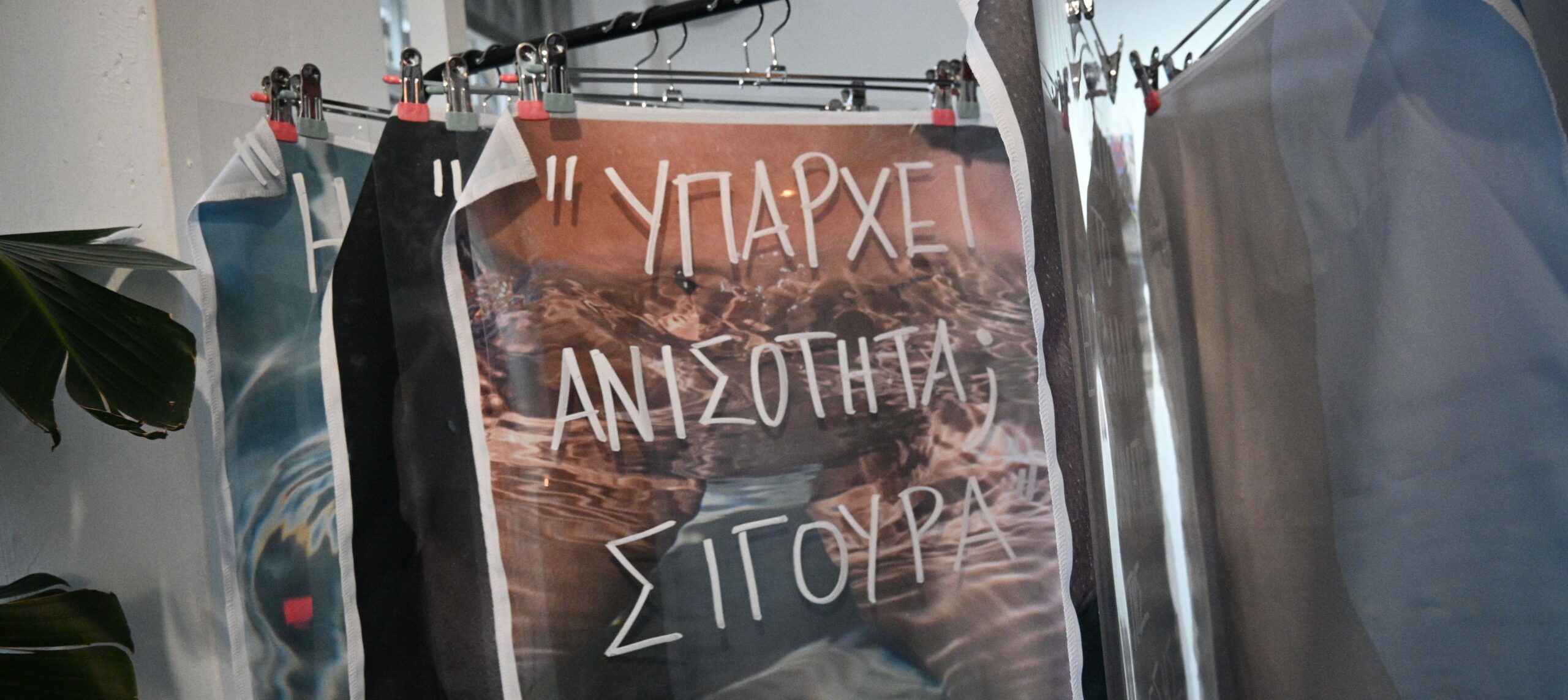
The ideas were first turned into an interactive exhibition (installation). The intimate space featured the women’s quotes embroidered onto underwear hanging on a line, like everyday laundry, to make the private public. It also included large fabric prints of bodies, with quotes written on clear PVC sheets floating in front of them. This multi-layered display allowed people to move around, read the words, and connect with the feelings and bodies visually.
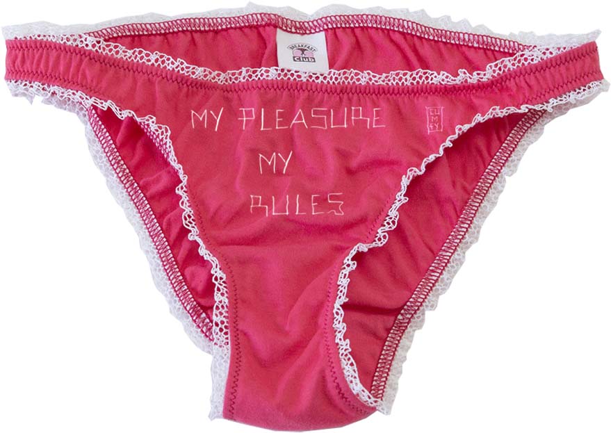
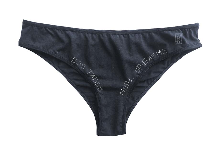
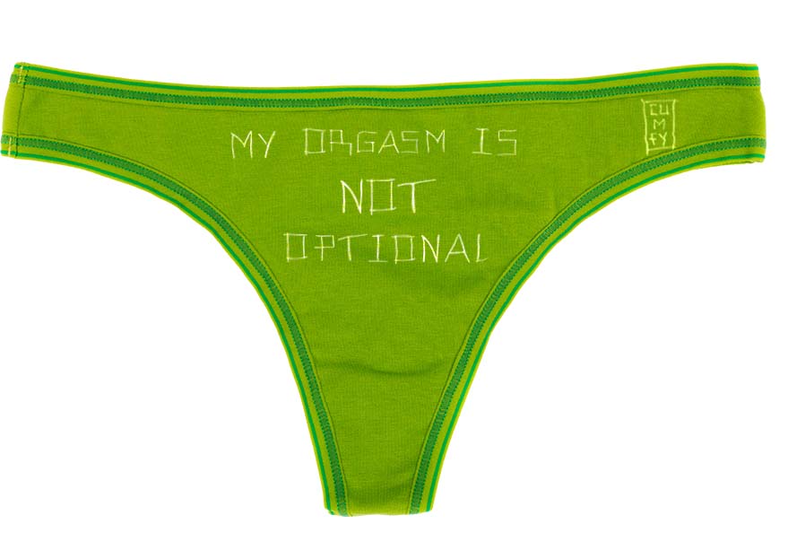
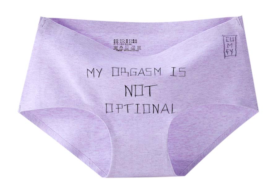
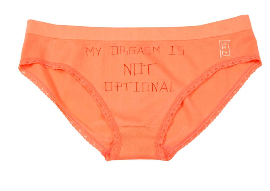
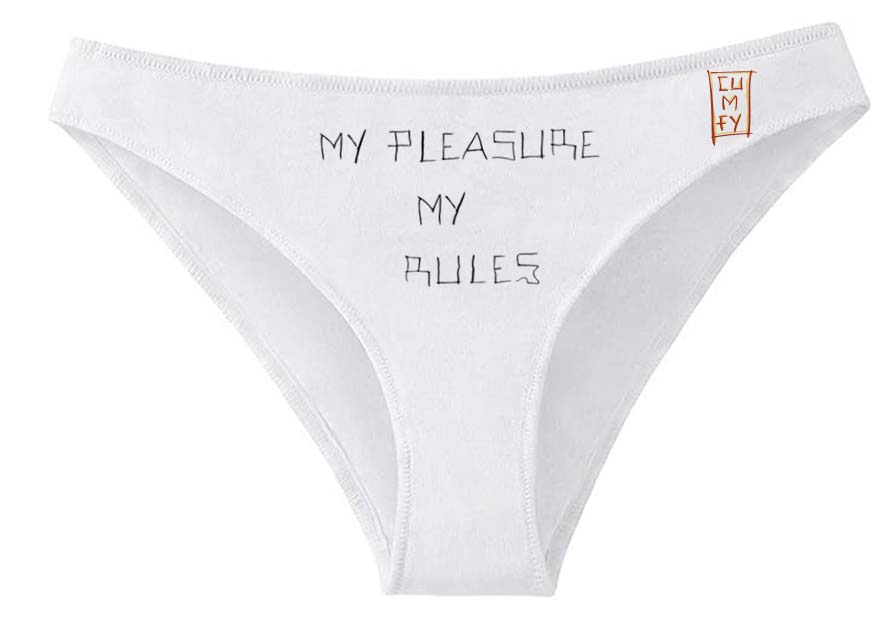
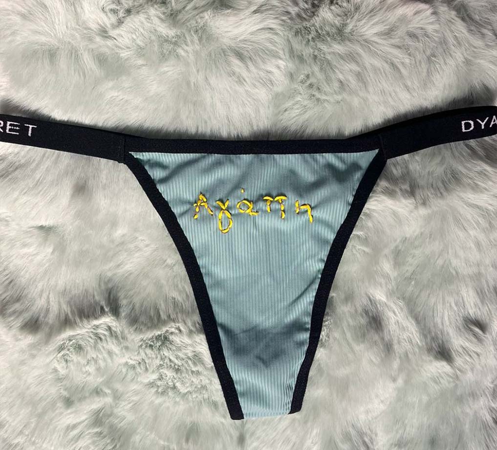
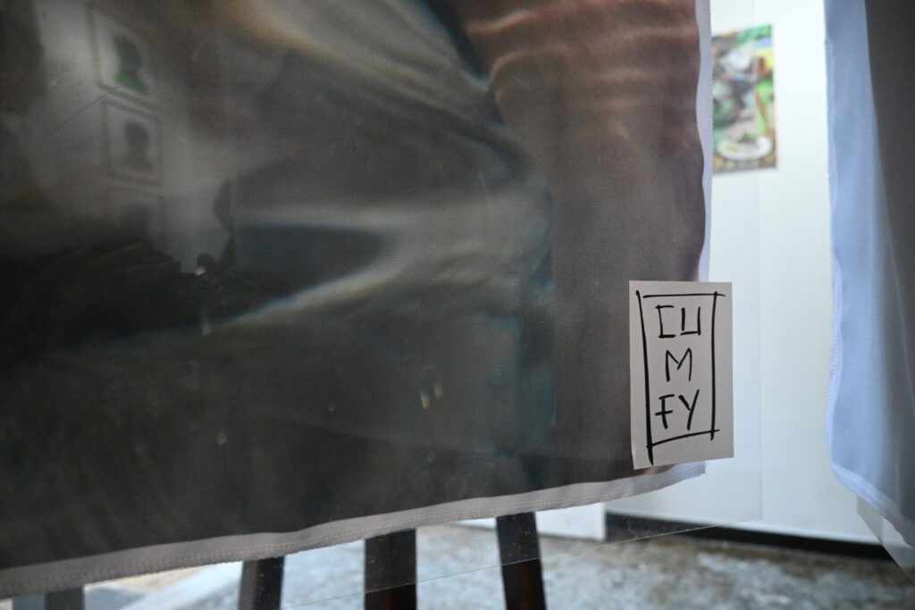
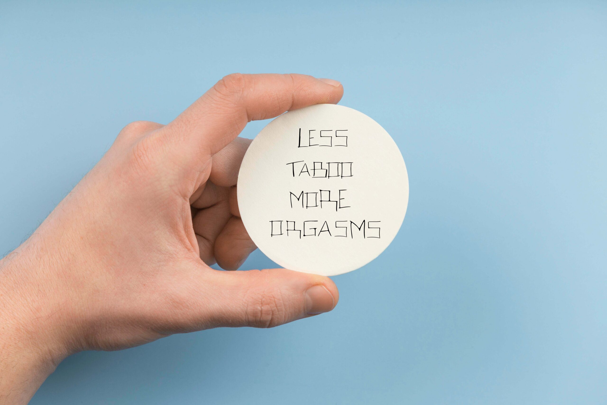
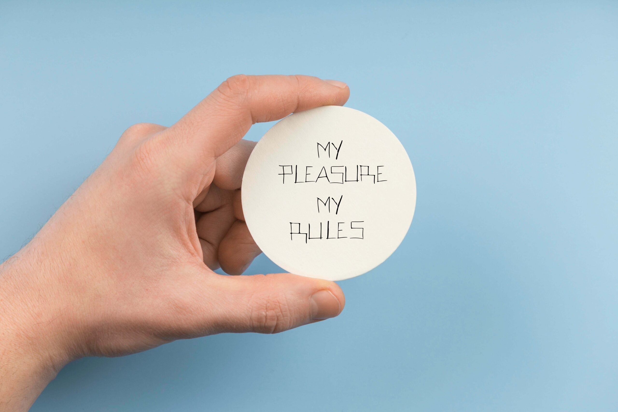
This creative process led to the final concept: the CUMFY brand. The brand name is a playful combination of ‘cum’ and ‘comfortable,’ linking sexual self-recognition with body safety and ease. The core product is underwear embroidered with the powerful slogans—such as “LESS TABOO, MORE ORGASMS” —so that women can wear a personal statement of strength and autonomy every day.
MA in Design (Middlesex University / AKTO) (2024-2025) Thesis


The central step was deciding where to place these powerful quotes. We chose the underwear garment—the most intimate piece of clothing—as the perfect medium for a political statement. This decision transforms the garment from a simple object into a visible carrier of personal truths. The quotes were then carefully embroidered onto the fabric, a slow process chosen to emphasize care and permanence. This technique highlights the themes of shame, pleasure, and autonomy directly onto the body, turning the intimate act of wearing underwear into a subtle, personal act of empowerment and awareness.


The photographic series was central to the final exhibition and the core concept. The work focused on capturing the body not as an idealized object, but as a site of lived experience, intimacy, and political presence. The goal was to reclaim the anonymous, female body from social scrutiny and place it in the context of personal narrative. By photographing the body in water, the images emphasize that sexuality is fluid, multidimensional, and individually experienced. This aesthetic choice highlights the body as a bearer of power and self-recognition, rejecting its consumption or objectification.
The final artistic presentation of CUMFY took the form of a space designed to offer a lived experience to the visitor, highlighting the constant tension between the private and public dimensions of female sexuality.
The central visual element consisted of photographs of bodies printed directly onto fabric. Transparent PVC surfaces bearing the handwritten quotes were positioned over these prints , creating a striking multi-layered optical effect where the collective voices appeared to float above the bodies. Additionally, a simple clothesline was used to display the embroidered underwear, referencing an everyday, intimate practice and connecting the personal narratives to a common, recognizable context. The materials—fabric, PVC, and embroidery—were chosen to enhance the sense of intimacy, exposure, and empathy, successfully inviting visitors to move through the space and experience the dialogue between the body and the word.
The visual identity for CUMFY was intentionally developed to reflect the brand’s core duality: personal comfort and political strength. The name CUMFY itself serves as a strategic wordplay, combining ‘cum’ and ‘comfortable’ (or ‘comfy’), directly linking sexual self-recognition with body comfort and safety. This naming concept was reflected in the simple, yet impactful Logo, which emerged organically from the custom typography.
The main visual element is the unique, custom-made typeface (font), was not made on a computer. It came from writing experiments on tracing paper using thick markers. This hands-on process made sure the letters look raw and handmade, showing the power of the women’s voices. By mixing strong, bold shapes with clear lines, the typeface adds a personal, sensitive feel to the powerful political messages, which is vital for the entire project.